Tag Archives: published_before_clean

DAT304 – Product Design

I had been thinking about the vague look of the product before the presentation of the original concept back in October. I wanted the device to look distinct and feel tactile.

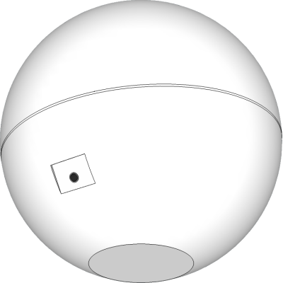
After considering how the device could be manufactured I concluded that the best way would be to make it in two halves. This would leave a join and there would be no way of avoiding this and leaving a good finish. I looked at other products that have had this challenge and have avoided it by turning it into a design feature.

With this assembly would now be feasible and also open the potential for modular components that can be added. I would attempt to balance the weight of the product using weights inside it to make it heavier and perhaps increase perception of quality. I would aim to produce the device with a high quality finish.

The electronics of the prototype are based on an Arduino, a small simple programmable device popular with electronics hobbyists. Much of this functionality would not be needed in a product and it would be possible to strip out and as Arduino is open source there would be no barriers to using the technology in both legal and technical terms. A bare minimum circuit board would be produced reducing costs.

The device would feature some kind of connectivity, either USB, BlueTooth or Wifi that would enable it to post its status to the internet. This could add a competitive aspect to the device where two or more people would compete to keep their Temperamental happy. With geolocation could provide real-time information on people’s home environments. The resulting data could be anonymised and released publicly for various purposes like visualisations.

I’ve decided to use a rechargeable battery inside the device, this means that the surface can be kept minimalist with only the screen, sensors and power supply socket and potentially a USB socket.
DAT304 – Logo and Branding

I thought I would start simple, find a nice font then play around with the typography.

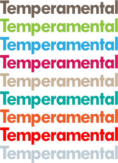
I tried the simple typographic logo in a range of different colours.

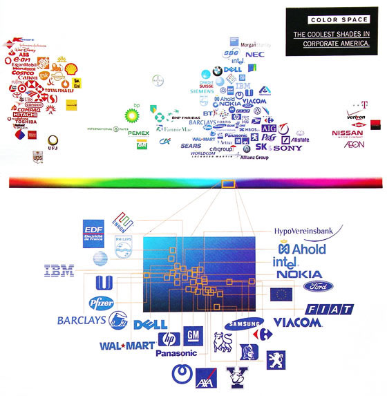
In 2003 Wired published this, it looks at the colours used in the logos of ‘the top 100 brands’:

Based on this we can see that blue is used very heavily with red also used heavily with yellow, green and pink barely used. So there seems to be psychological and cultural reasons for brands choosing certain colours. A brand must choose to conform to the patterns and benefit from their associated connotations or choose to try and take advantage of the lack of other brands using a certain colour.

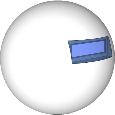
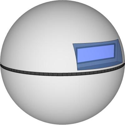
The next stage was to make the logo tell people about the product my product can be summarised as an unhappy…

…robot.

This logo is functional, along with the slogan it should be able to convey the nature of the product. I chose orange as it’s a strong appealing colour which looks good against light and dark backgrounds.

DAT304 – Slogan Ideas and Description

The slogan is an important part of a product’s brand, it lets potential customers know what the product is, what it’s for and can make more sense of the product’s name.
I’ve come up with a few options for slogans here:
  • A machine for complaining.
  • A toy that hates everything.
  • An unhappy robot.
  • The Sad Robot
  • The Complaining Robot
I will need to do some market research and try out different ideas for the slogan.
My first attempt at writing the single sentence description was as follows:

Temperamental is a small spherical device that senses its environment and then complains about it.

I thought this was a pretty good start, most of the key details about the product are in there including the humour that is important for the product while avoiding going into more technical details. The crucial thing I feel it lacks is referencing the interactive game-play aspect, without this there is only subtle implication that it is a toy.

Temperamental is a small spherical device that senses its environment and then complains about it, only by changing its surroundings you can make it stop.

I felt this could get across the idea of the product across both concisely and effectively.

DAT304 – Name

I usually have trouble naming things but in this case it was fairly easy to come up with one.

The first thing I did was to check a thesaurus for words that represent the inconsistent and fickle nature of the product’s ‘personality’.

Out of these Temperamental really stood out as it incorporates the concept of something inconsistent and annoying, implies that the product is something playful and contains the words ‘temper’ and ‘mental’ to further reinforce the concept. My doubt with this as a stand alone name is that it doesn’t really convey that it’s a toy but in context and with a brief strap-line there will be no problem explaining what it is in the same way thousands of brands do.


DAT304 – Business Idea

My business will produce an electronic toy aimed primarily at the gift market. The toy will take the form of a tactile sphere and feature a small LCD display and a number of sensors. Using the data from these sensors it will display complaints about its environment on the display. It is up to the user to make the device happy.

The idea is based on an earlier project for DAT301 (Realtime) and the feedback received after presenting it. I felt that it could be converted into an interesting product and incorporate new game-play elements, such as making it possible for the device to have a happy state, the challenge being to achieve the correct balance of a number of environmental factors.

If the ball is too hot it complains about the heat on the display, if it’s too cold it also complains using its large array of phrases. The main environmental factors it could sense are temperature, light, proximity and orientation.

For my business I want to focus around this single core product and hopefully in the long term branch off from it with a range of products in the same vein.

DAT301 – Bioresponsive Game

We were demonstrated and introduced to a number of biometric recording devices including a brain wave measuring headset called a MindWave and a biofeedback sensor kit which had  several different sensors. Based on this we had to create an interactive project making use of this technology.

Writing this after the presentation, it’s fair to say that none of the group were happy with the outcome. We felt that the main problem was the lack of a solid and interesting concept and appealing aesthetics that related to it.

We decided for the sake of variety to avoid Arduino and were attracted to the idea of producing a game that was affected by the level of stress experienced by the player. To get an early start I proposed porting over a game I made in flash in the first year (the poorly named Klepto1), into Processing as a base to build of off. I was more concerned with the technical detail of the programming with extensive use of object orientated programming and making it flexible for the group to use. After this we left completing the remainder of the project too late and had to rush, dropping the use of live data and then there was also confusion over what pre-recorded data we were using. We believe we can avoid this happening again.