I thought I would start simple, find a nice font then play around with the typography.
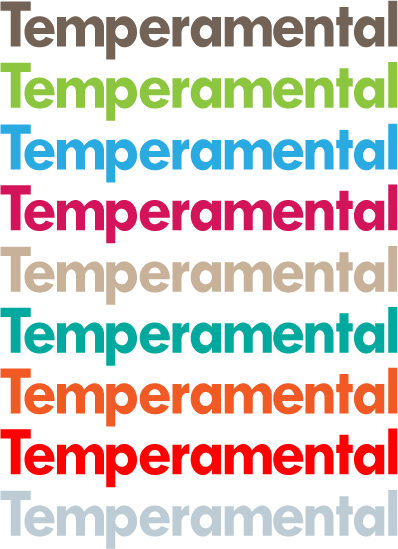
 I tried the simple typographic logo in a range of different colours.
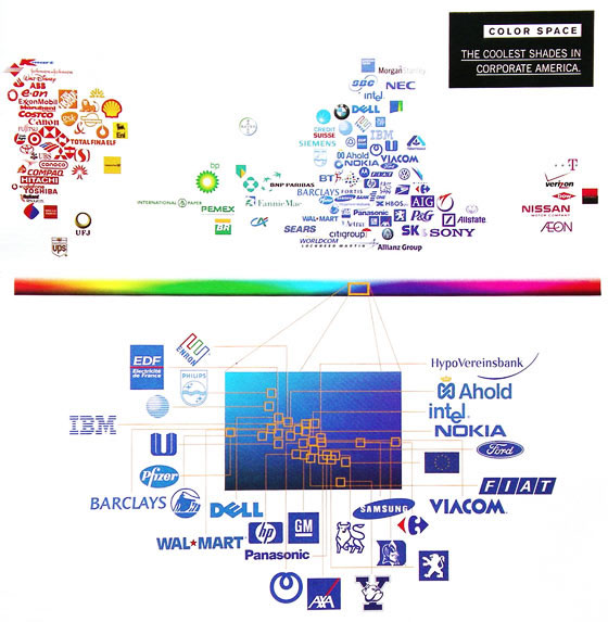
In 2003 Wired published this, it looks at the colours used in the logos of ‘the top 100 brands’:
Based on this we can see that blue is used very heavily with red also used heavily with yellow, green and pink barely used. So there seems to be psychological and cultural reasons for brands choosing certain colours. A brand must choose to conform to the patterns and benefit from their associated connotations or choose to try and take advantage of the lack of other brands using a certain colour.
The next stage was to make the logo tell people about the product my product can be summarised as an unhappy…
…robot.
This logo is functional, along with the slogan it should be able to convey the nature of the product. I chose orange as it’s a strong appealing colour which looks good against light and dark backgrounds.


